Norra
A quiet, one-thumb morning ritual that helps a person see their patterns and stay steady — without ever feeling judged, gamified, or overwhelmed. Built solo, from lived experience, end to end.
- Year — 2026
- Role — Founder / Solo
- Platform — Installable PWA
- Status — Live
I live with bipolar disorder. I know what keeps me well — sleep, medication, a steady routine — and I know how quickly that can slip. What I needed was honest data about my own state, gathered so gently that I would still gather it on the hardest days.
Every tracker I tried leaned on streaks, badges, bright colours and nagging notifications. For this condition those mechanics backfire: a bad day becomes a broken streak, a mood marked in red feels like a verdict, and a push notification adds pressure exactly when capacity is lowest. So the app gets abandoned — precisely at the slide into depression or the early edge of mania, when honest tracking matters most. Norra exists to be the tool you don’t abandon.
These are intentional absences, not missing features. Each protects the user from a specific harm — and each is enforced in code, not just in guidelines. No streaks or scores: relapse is not a losing streak, and the backend schema cannot even store an aggregate. No colour-graded moods: colour-coding assigns judgment and breeds shame about “red” days, so every state is recorded in the same ink. No emoji: cartoon faces flatten real states and can feel mocking on a hard day.
No nagging notifications — at most one gentle, optional morning reminder the user fully controls. And no good/bad ranking: the app never grades a day or a person. It receives them; it doesn’t celebrate or punish.
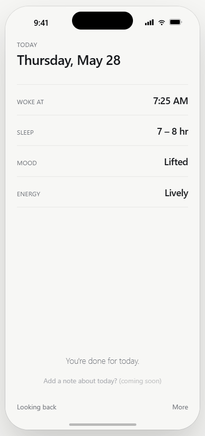
The one thing Norra asks of you, first thing after waking: when you woke, how you slept, your mood, your energy. It is designed for the lowest-capacity moment of the day — one thumb, full-screen steps, word lists instead of keyboards, every primary action within thumb reach. Mood words are Heavy · Low · Steady · Lifted · Light — states, never grades.
Tapping a word commits it and auto-advances — no confirm button. The wake-time wheel is a native scroll-snap picker, which buys mouse, touch and keyboard support for free.
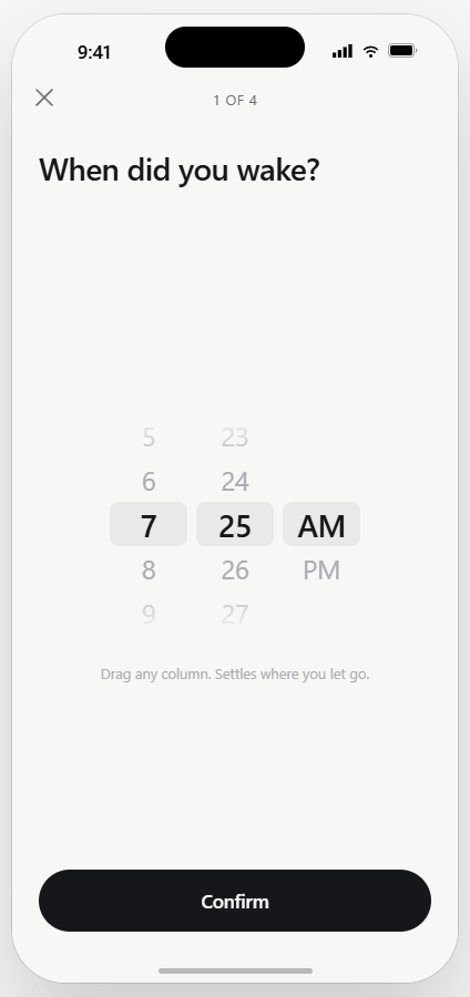
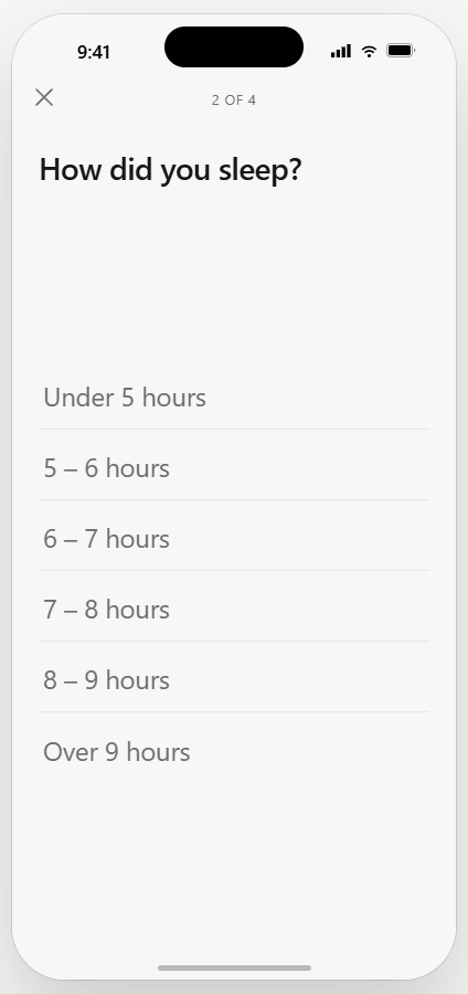
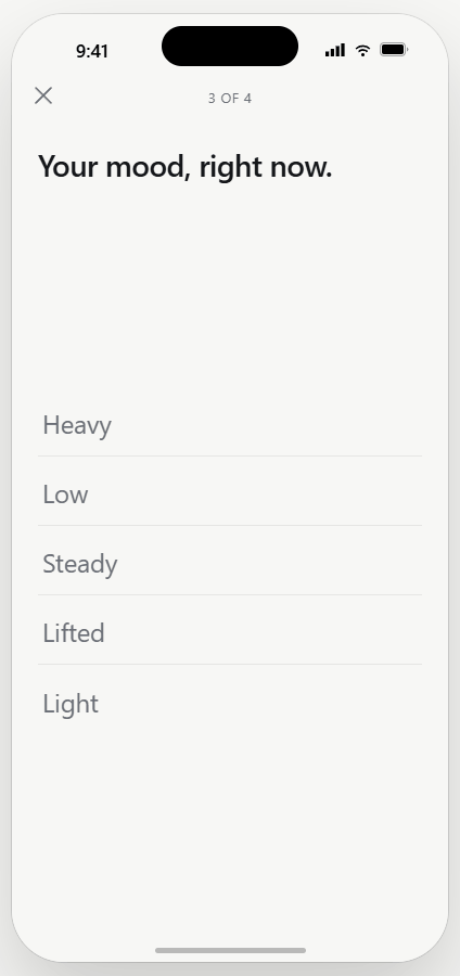
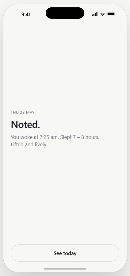
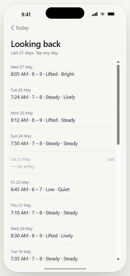
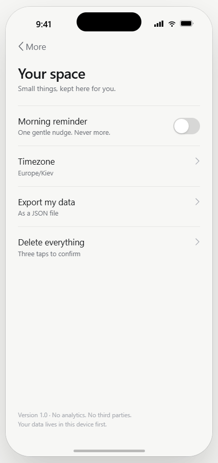
The whole Phase-1 app is seven screens: Welcome, Today, Ritual, Done, Looking back, More, Your space. Completion says “Noted.” — a journaled sentence, not a trophy. Looking back is a gentle scroll of days; empty days dim, they never go red. The More screen honestly lists what is coming, so the shape of the product stays visible without applying any pressure.
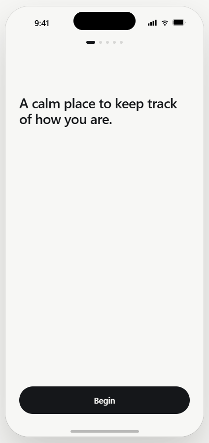
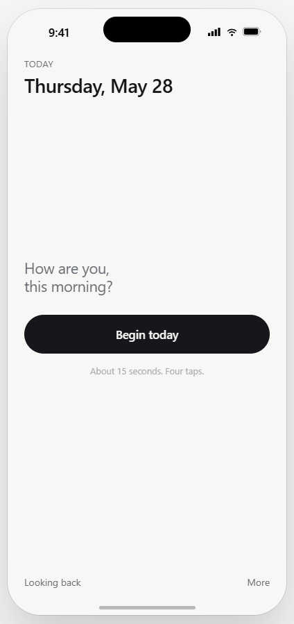
Because the brief forbade colour-grading, emoji and decoration, the visual exploration concentrated where it still could: surface tone, type scale, material and motion. Three full directions were prototyped over the same working spine — A · Calm (paper white, near-black ink, no accent at all), B · Ink & Tide (bone paper, sumi ink, material depth), and C · Even Keel (cool paper, with an amber exhale at completion only).
Ink & Tide won: bone paper instead of cool white, sumi near-black ink, depth from material rather than gradients. It reads like a handmade journal — analog, private, worth returning to.
A tiny palette: paper, ink, and a single signature hue — “Even”, a desaturated periwinkle. The one rule is that the accent marks an action or a completion, never a state or a value. It is allowed in exactly three places: the single primary CTA per screen, the balance mark’s active state, and the completion moment. It is forbidden on any mood, energy or sleep value, on charts and large fills, on destructive actions, and as decoration.
Mood and energy are always ink — the cardinal no-colour-grading rule, held even against the brand colour itself. Type is system SF Pro, so there is nothing to bundle. Depth comes from material rather than decoration: one inline SVG grain tile at 4.5%, two or three layered shadows calibrated per surface, and an ambient tint under 6% that follows the clock — all collapsible to Subtle or Off from a single accessibility setting.
Norra’s mark is a libra balance: a fixed arch, a two-armed beam on a centre pivot. On opening the app it performs a slow, damped 4.8-second settle from a tilt to perfectly level. The starting tilt scales with the logged mood’s distance from Steady — a heavier or lighter day swings wider — but it always comes to rest level. It never holds an off-level pose, which could read as “you’re broken today.”
The beam inks over to periwinkle once today is logged; after settling, a whisper of ±0.35° keeps it alive. Under reduced motion it is level, centred and static.


This is special-category health data, so the trust promises had to be structural. Norra is local-first: every write completes in the device’s IndexedDB before it ever touches the network, so the ritual works offline with no spinners, and sync drains from an outbox on boot. A Cloudflare Worker API handles Google sign-in and HMAC JWTs, and its logging layer strips every mental-health field — mood, energy, sleep, wake time — from every log line.
Each user’s data lives in their own isolated, SQLite-backed Durable Object, keyed to their identity: isolation by construction, with no shared store to query across users, and a schema that literally cannot store a streak or a score. No analytics, no crash reporting, no third-party scripts. Export everything as JSON any time, delete everything in three taps, and prefers-reduced-motion is honoured throughout.
Beta testers lived with bipolar disorder — a vulnerable population, and special-category health data, so the beta ran deliberately small. A first wave of 5–10 people I could talk to one-to-one answered the only question that mattered: did anything break, confuse, or hurt? A second wave of 20–50 followed once that one came back clean. The public community funnel stayed shut throughout, because a bad first impression in the communities that matter most is unrecoverable — and it opened only once the product had earned it. Norra is now live.
The readiness audit treated ethics as blockers rather than backlog, and all of them shipped before the first invite: a plain-language privacy policy, a “not a medical tool” disclaimer in the welcome flow, crisis resources reachable from every session, and an informed-consent and welcome pack for every tester.
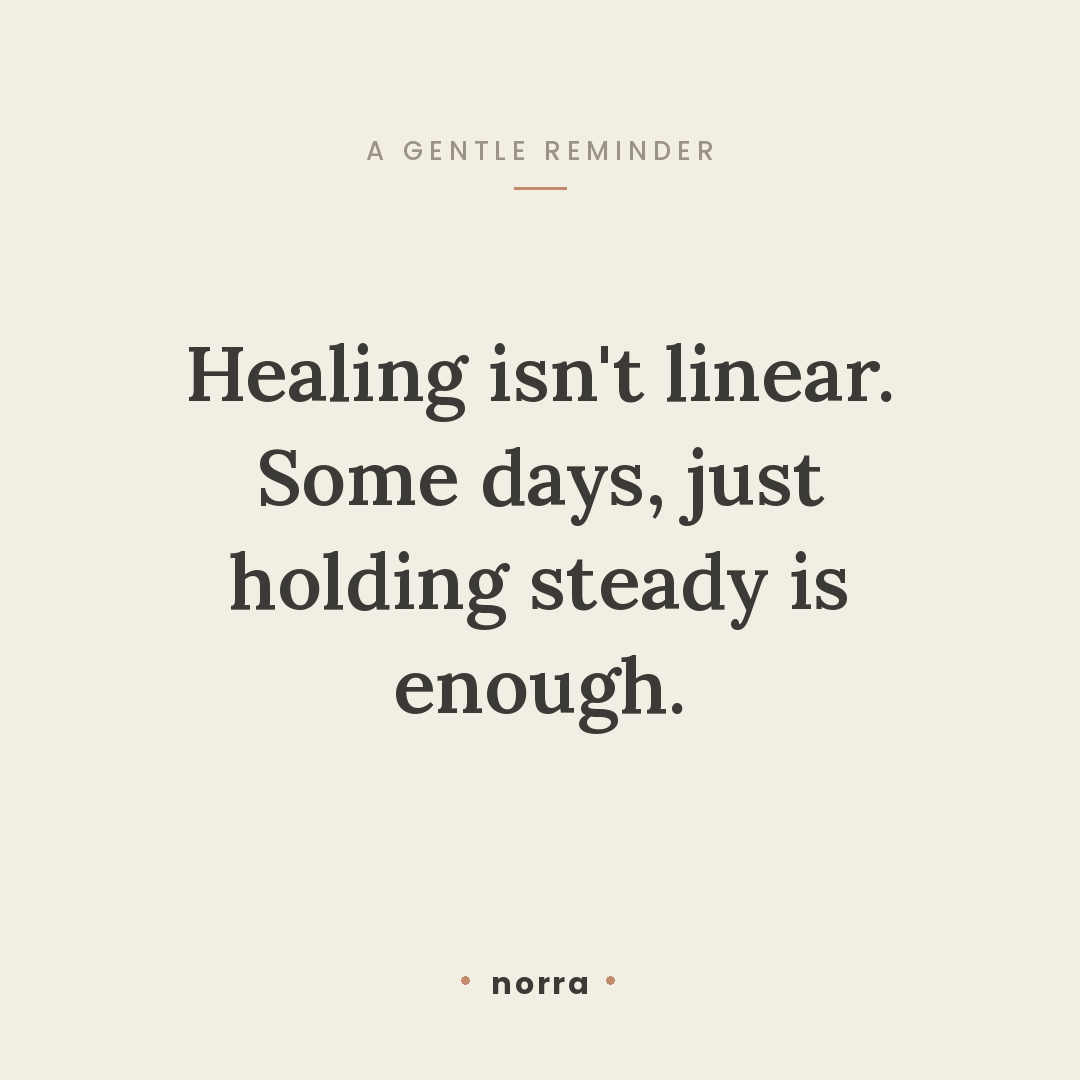
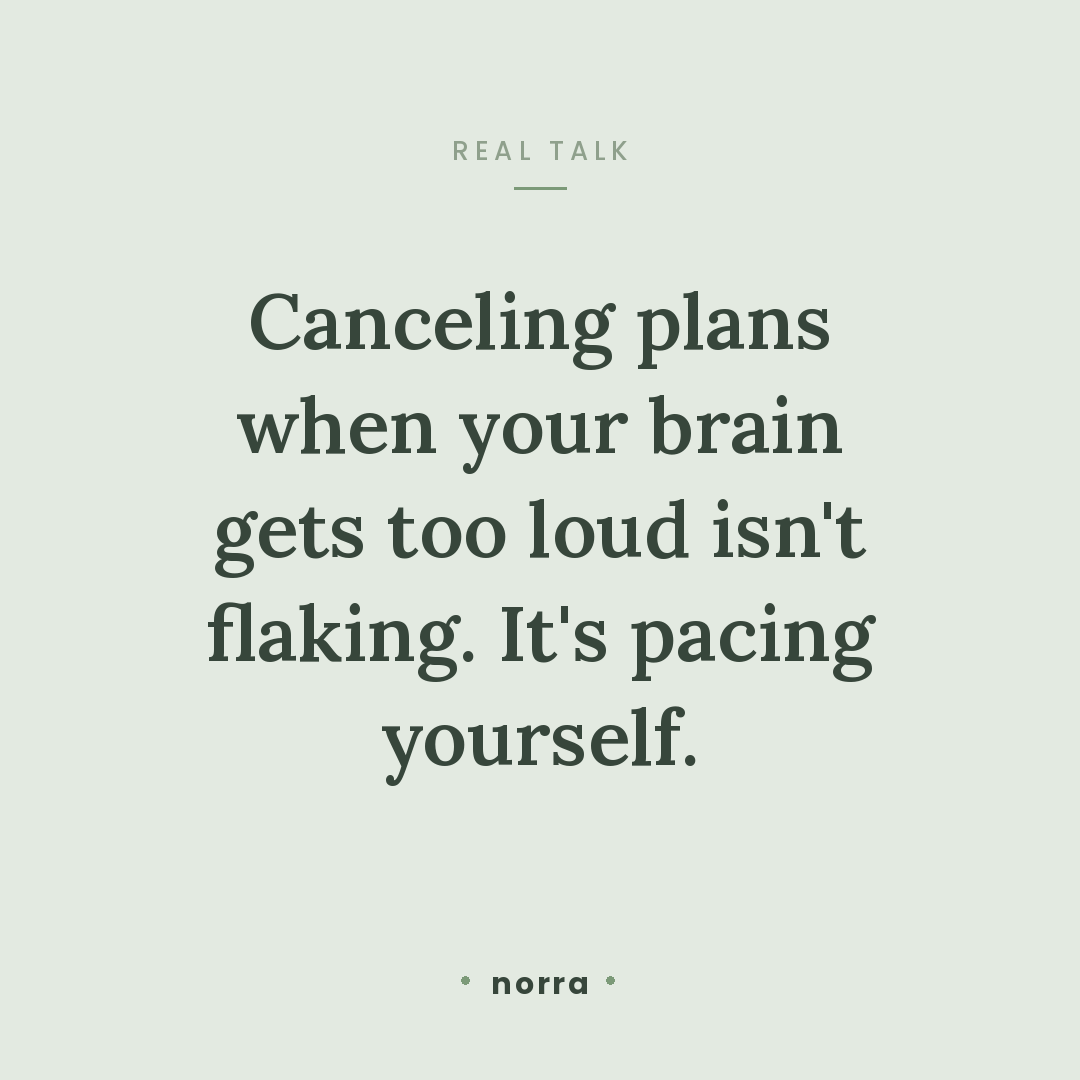
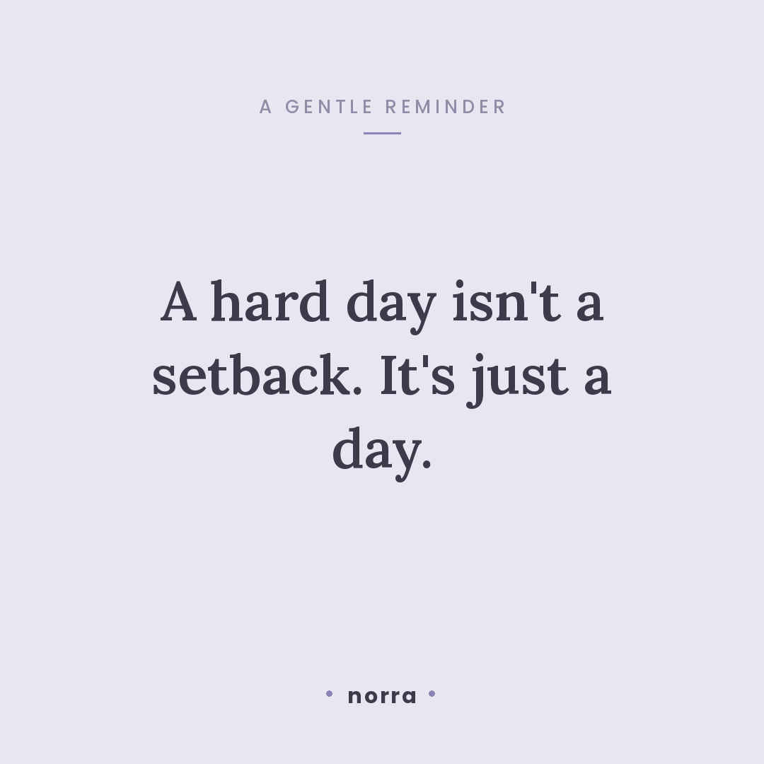
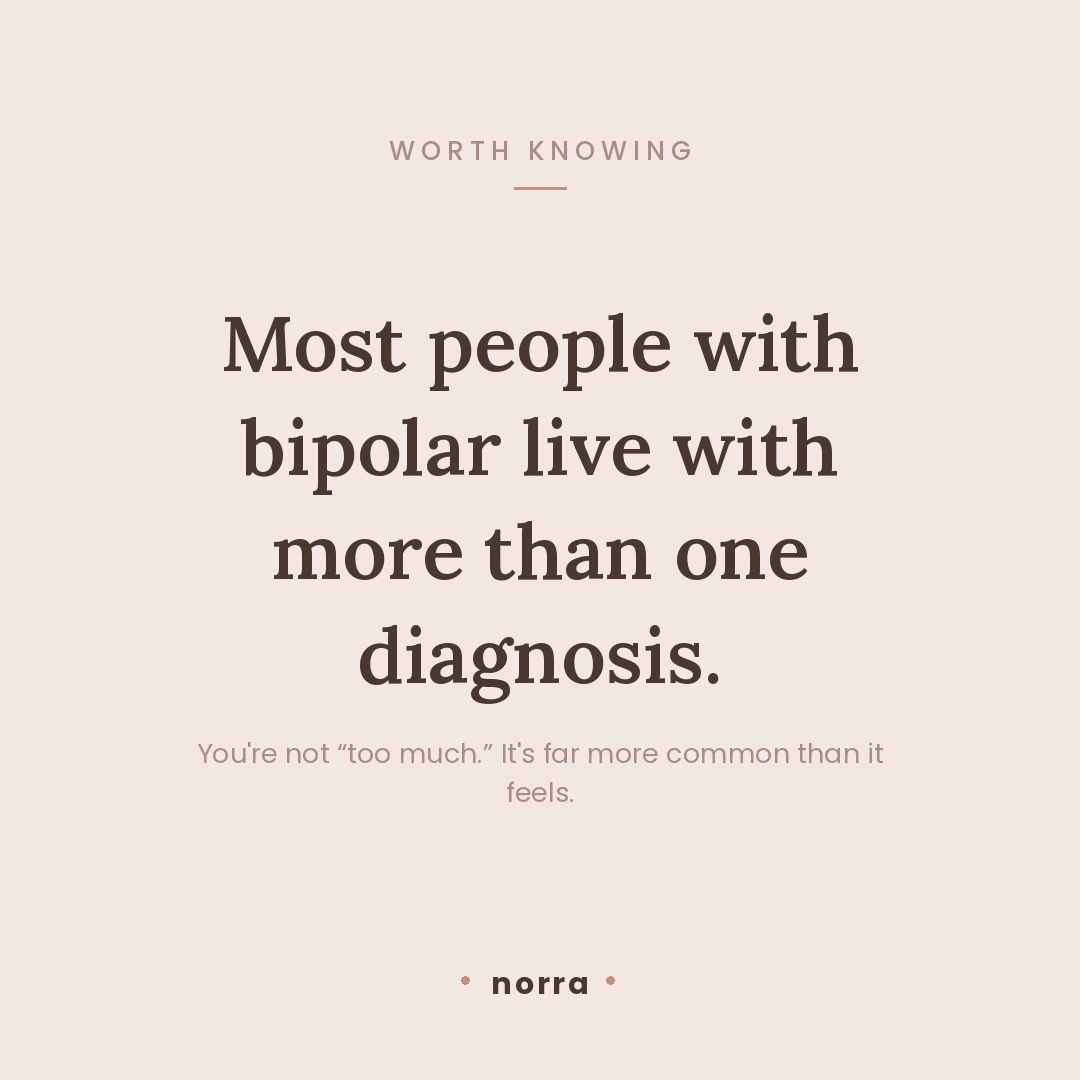
The social system is the visual equivalent of a quiet, steady voice — five muted palettes rotated across a gallery-wall grid, serif headlines, a small lowercase wordmark. The same non-negotiables apply off-product as on: no “day 30”, no “you crushed it”, no toxic positivity. It validates steadiness, never performance, and runs alongside a content calendar, community playbooks, and app-directory listings.
I carried Norra from concept document to live product alone: product strategy, the design system, the frontend and backend, the beta programme and the growth engine. AI tools were a genuine multiplier — Claude as a design partner for exploring visual directions at high fidelity, and Claude Code for implementation — but every constraint that makes Norra what it is came from lived experience, and every decision passed through one filter: would I still open this on my worst day?
The thing I’m proudest of isn’t a feature. It’s the restraint — a product defined by a thousand no’s, so that the one thing it asks of you stays effortless.